Sweeeeeeeep.
Canadian Curling Association Curling Event Branding Design
Client — Canadian Curling Association
Project Scope — Logos, Advertising, Marketing Collateral, Vehicle Graphics, Event Materials, Promotional Apparel and Web Graphics.
-
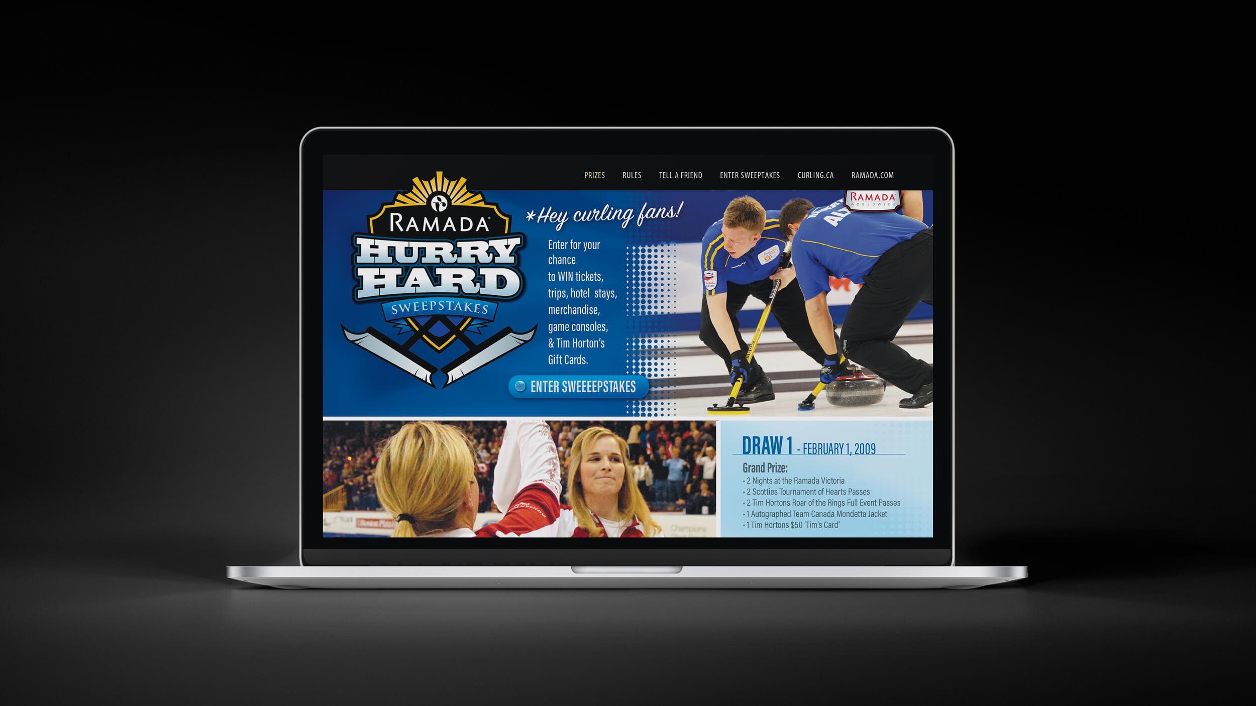
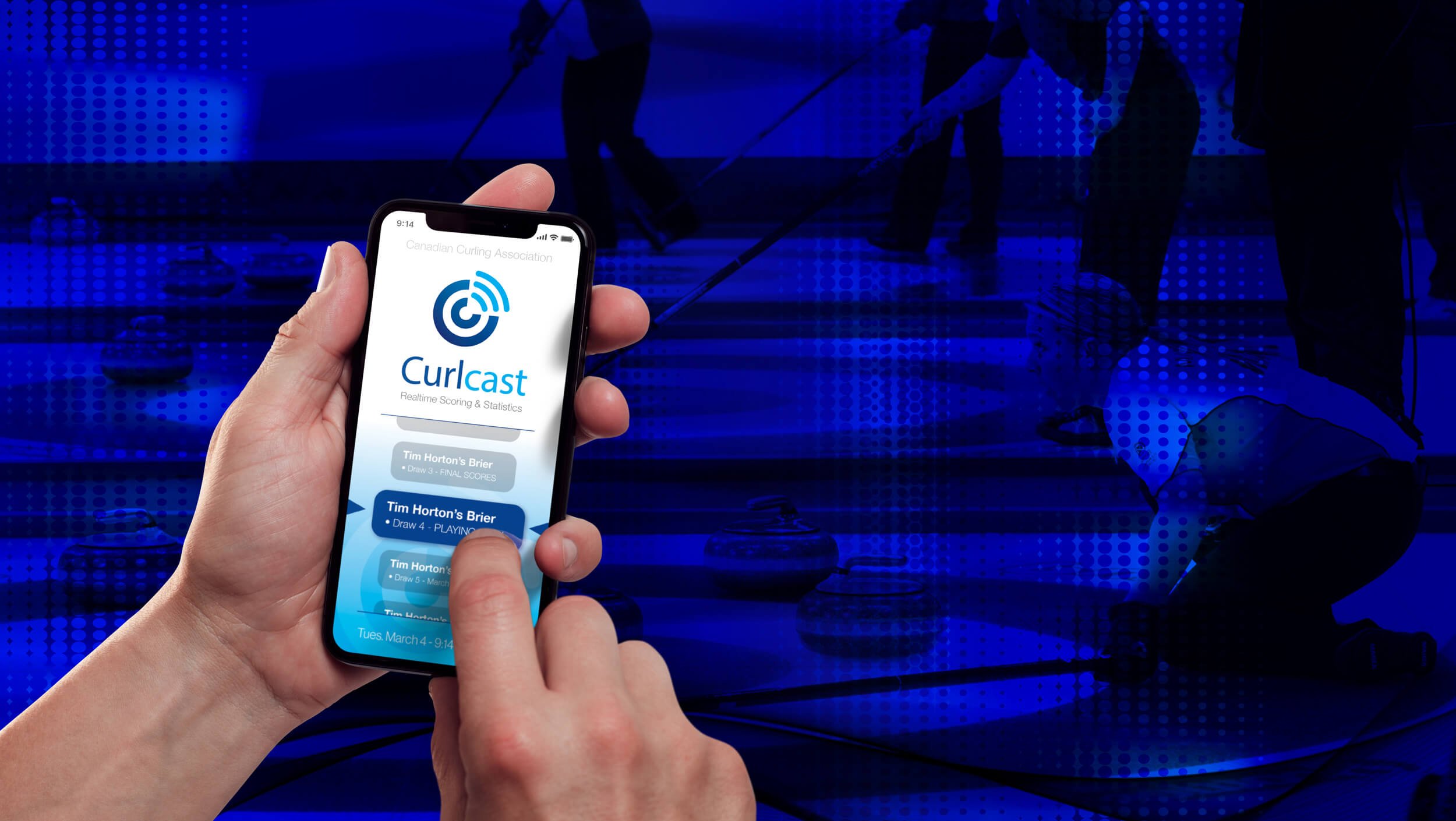
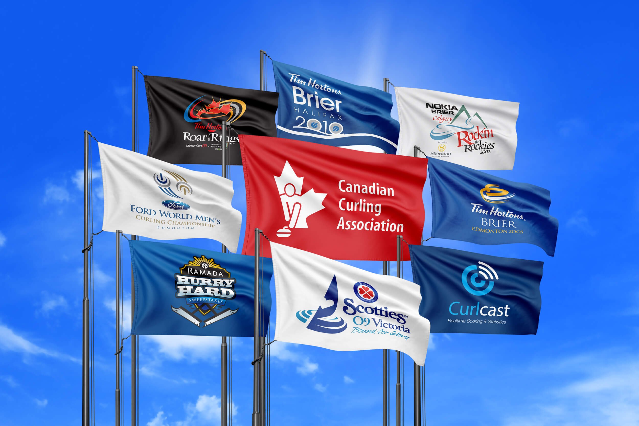
As the agency of record for various Canadian Curling events we designed and developed the logos, marketing and event materials for the 2004 Calgary Brier, the 2005 Edmonton Brier, the 2007 Ford World Men’s Curling Championship, the 2009 Victoria Scotties, the 2009 Roar of the Rings and other projects including a Hurry Hard Sweepstakes and Curlcast online scoring system. Each event set new attendance records, and in conjunction with the organizing committees, we were able to raise the awareness and image of curling to new levels of professionalism and appeal to a younger demographic. Rock on.
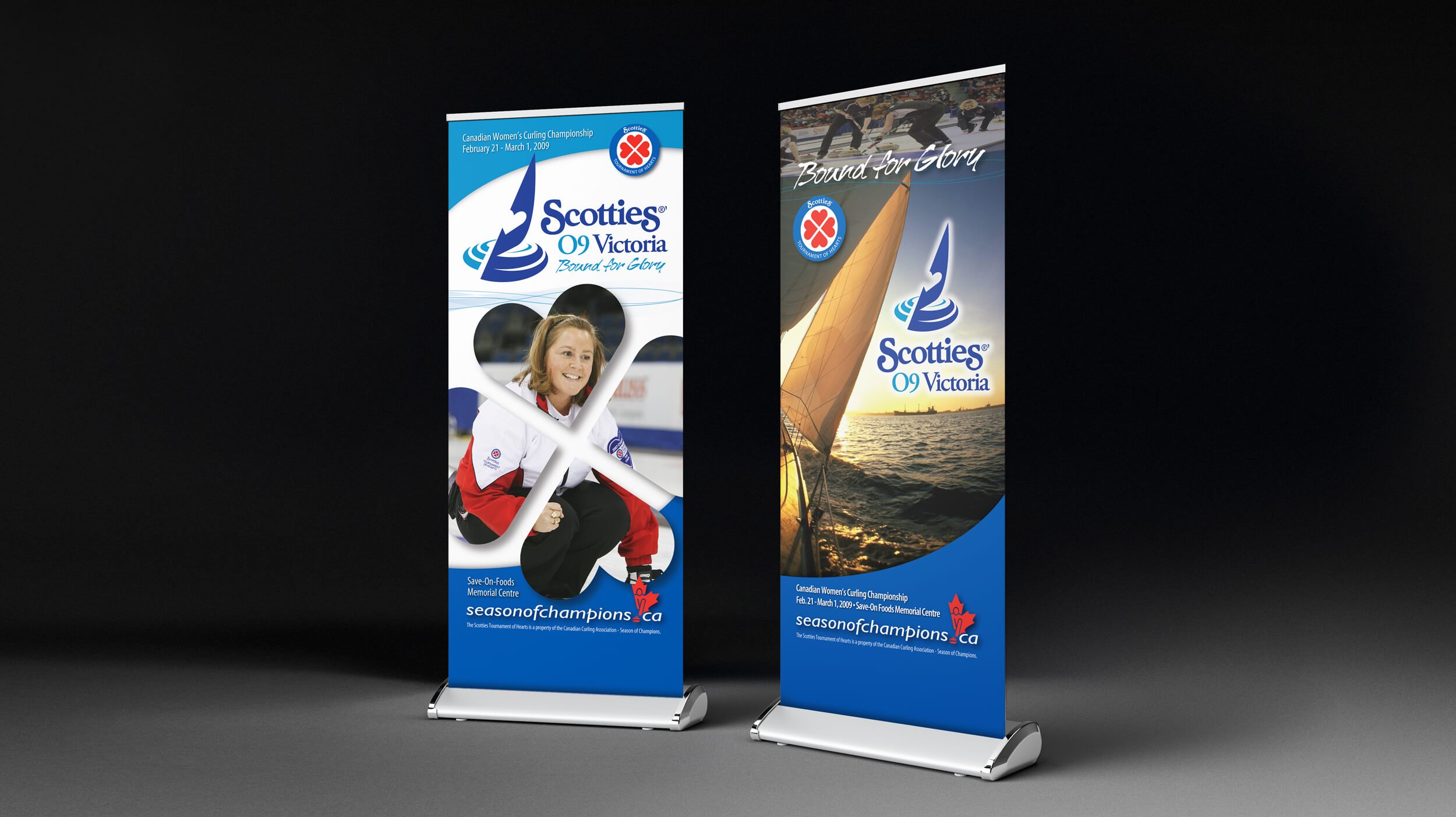
Setting sail for the best in Women’s Curling.
Scotties Tournament of Hearts
⇩
Project Scope — Communication Strategy, Logo, Event Graphics, Advertising and Marketing Collateral.
-
During our tenure as the design firm for the Canadian Curling Association, we had the opportunity to design the logos and marketing materials for events large and small across Canada. The Scotties Tournament of Hearts in Victoria was a favourite - graphically combining the water and sailing aspects of Victoria with curling rings and rocks.


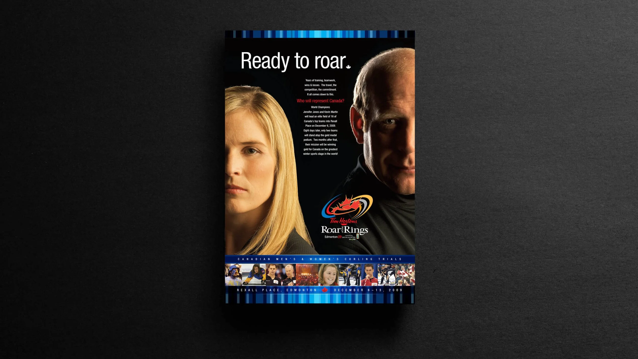
From curling rings to Olympic rings.
CCA Roar of the Rings Olympic qualifier
⇩
Project Scope — Communication Strategy, Event Graphics, Art Direction of Photography, Advertising and Marketing/Point of Sale Collateral.
-
The 2009 Roar of the Rings was an amazing event to be a part of. It’s the final event that decides the Men’s and Women’s Curling teams that will go on to represent Canada at the Olympics. For these elite teams, there was more on the line than a trophy, this was their chance to be Team Canada. As such we took a two tiered approach - the early launch materials were dramatic and focused on the top athletes vying to qualify. The later materials focused on the red, white & maple leaf, focusing on Canadian pride leading up to the games - this approach encouraged people to follow their favourite curlers, and built excitement to attend the event to see who would be Canada’s team.

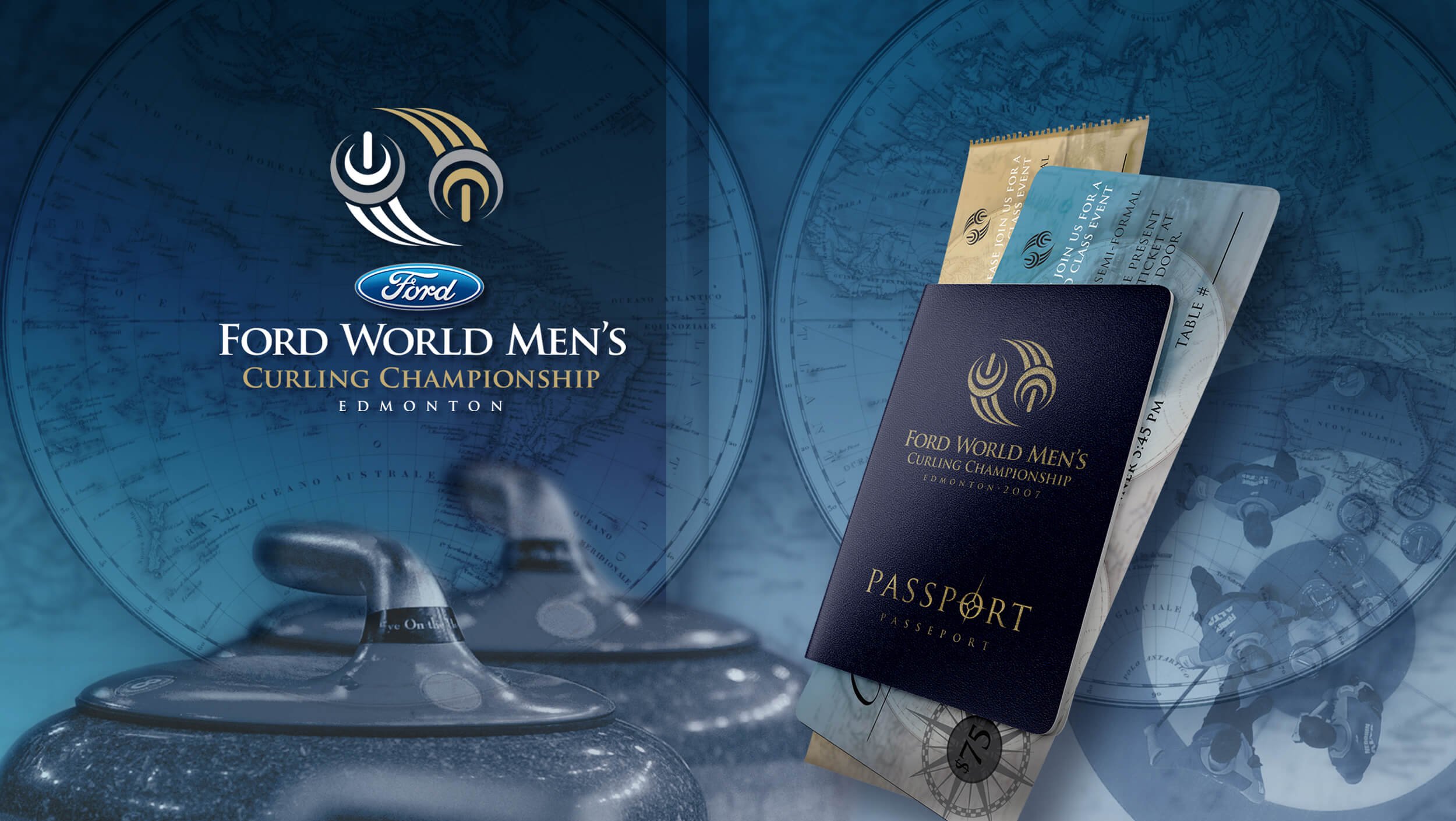
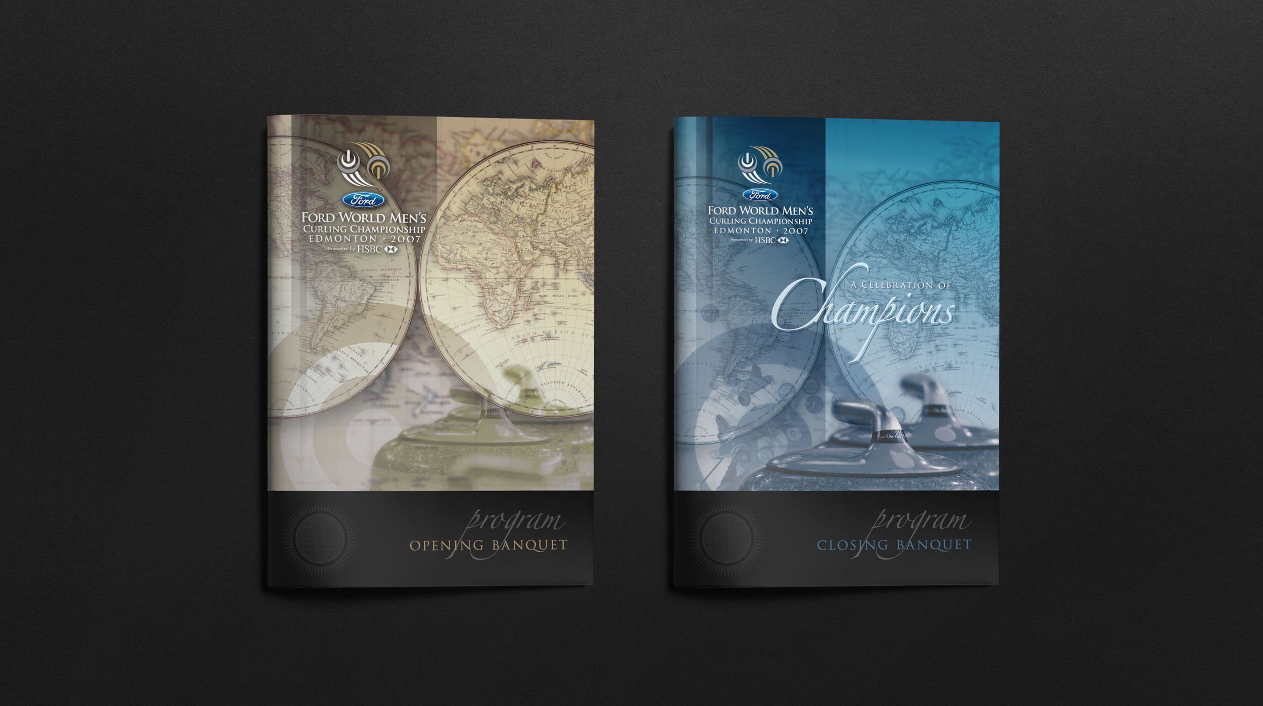
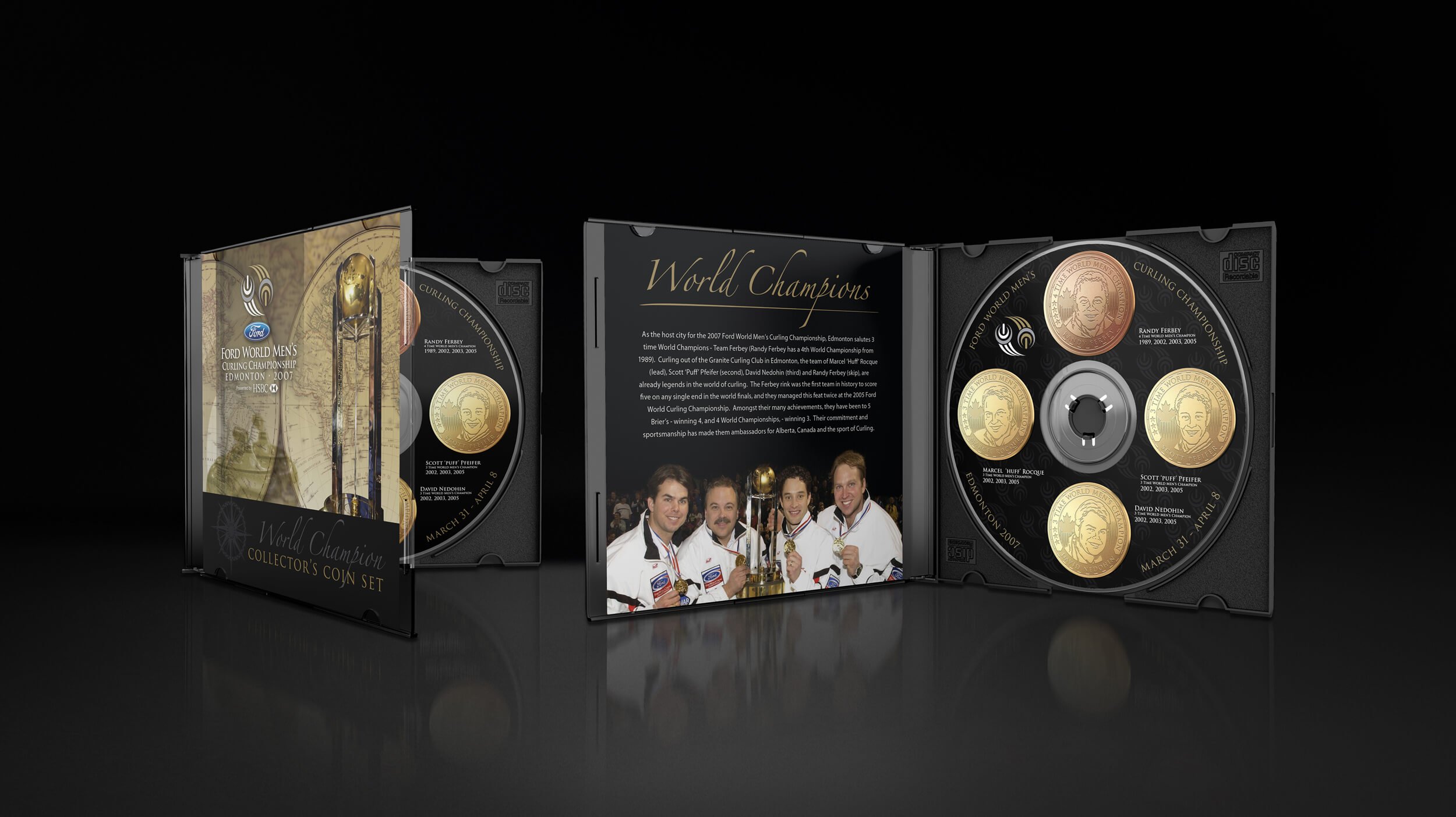
A world class look for the Ford World Curling Championships.
Ford World Men’s Curling Championship
⇩
Project Scope — Communication Strategy, Logo Design, Event Graphics, Advertising and Marketing/Promotional Collateral.
-
As part of our work with the Canadian Curling Association, we had the opportunity to create the brand identity for the 2007 Ford World Men’s Curling Championship. The international event required branding from the ground up including the logo, advertising, promotional and event marketing materials. The stylized logo symbolizes the two team curling rocks, the ‘speed lines’ are derivative of the ‘curl’, and also form the shape of the globe, blue for men’s, and gold for the golden globe trophy that goes to the winning country. By all accounts, the Edmonton event was a huge success, the logo is still in use today, and has also been adopted by the Women’s World Curling Championship. With the efforts of everyone involved, it took the World Curling Championship from small venues in Europe to filling Rexall Place in Edmonton!

Extra Ends
Projects that were right on the button.
⇩
Project Scope — Advertising, Web Contest, App Logo & Halifax Brier Logo
-
From billboard advertising to web contests, a real time scoring app and the 2010 Halifax Brier logo, we worked with a fantastic CCA team to bring all these graphic projects to life.