A fresh new look for a classic brand.
IGA Rebrand
Client — Sobeys Inc.
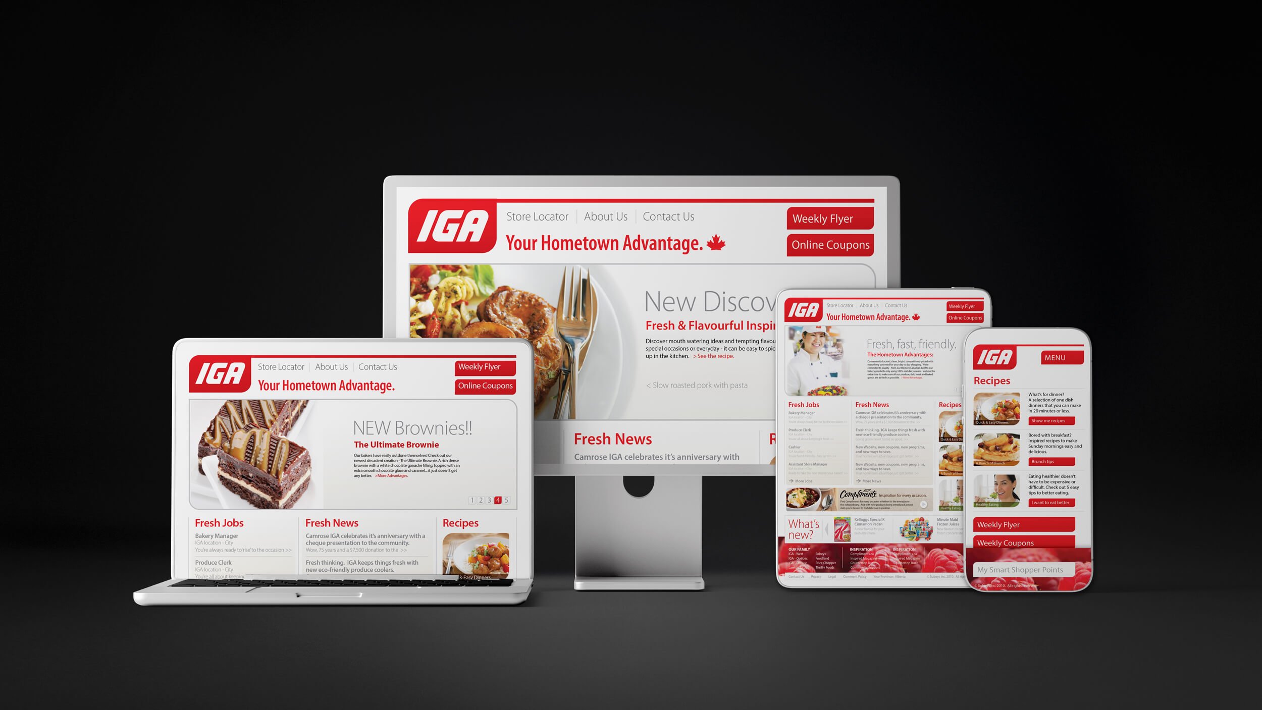
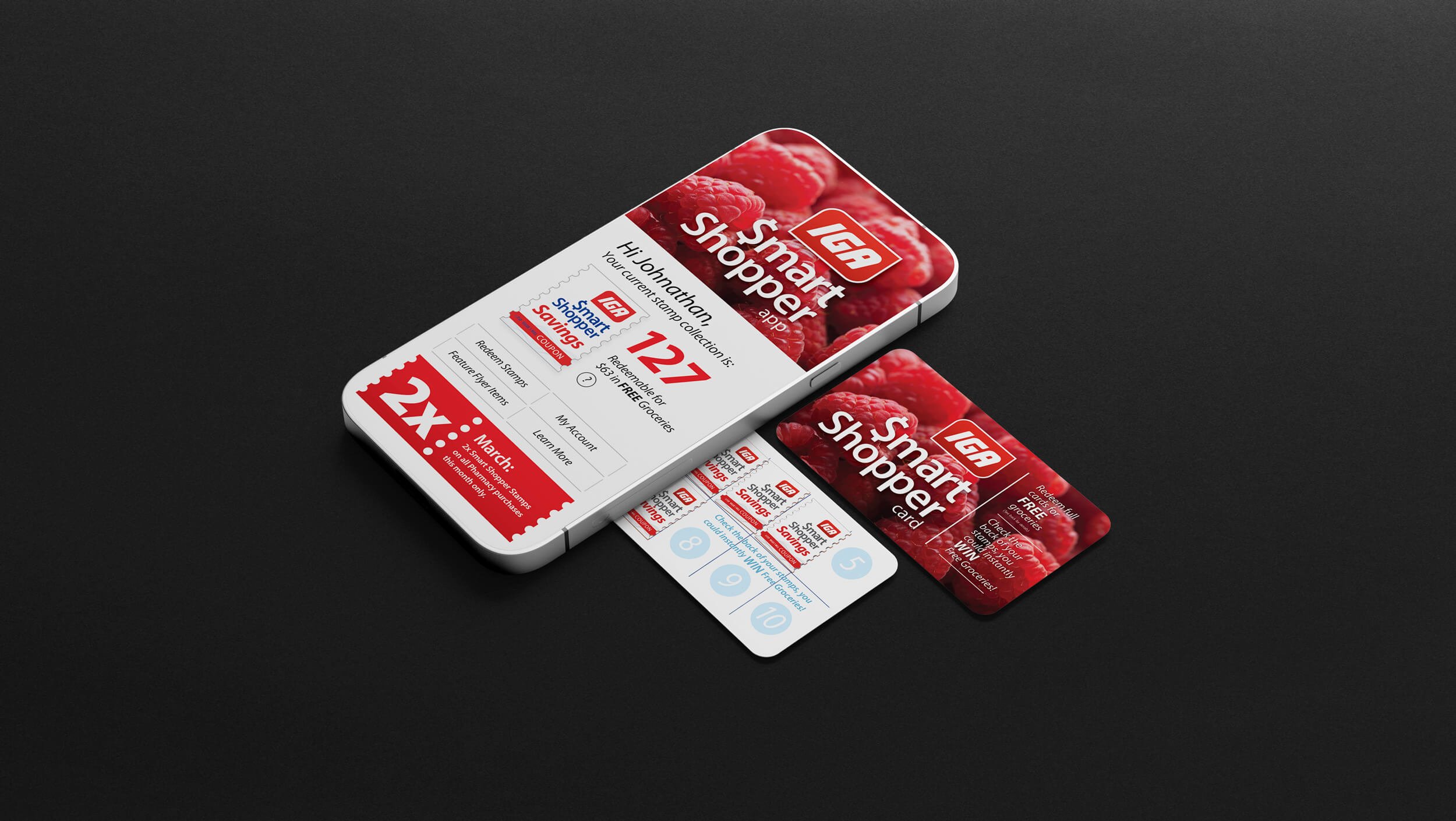
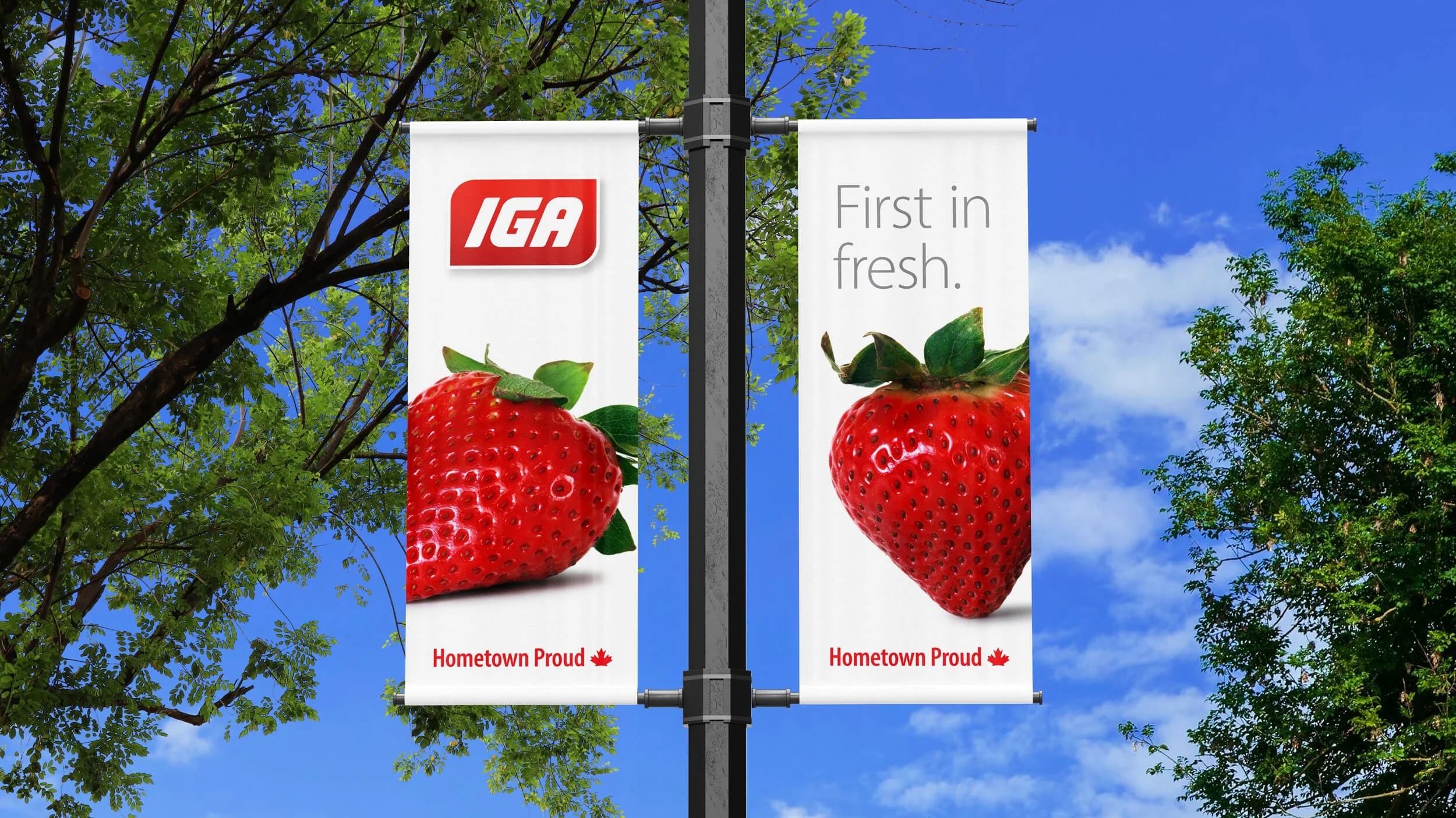
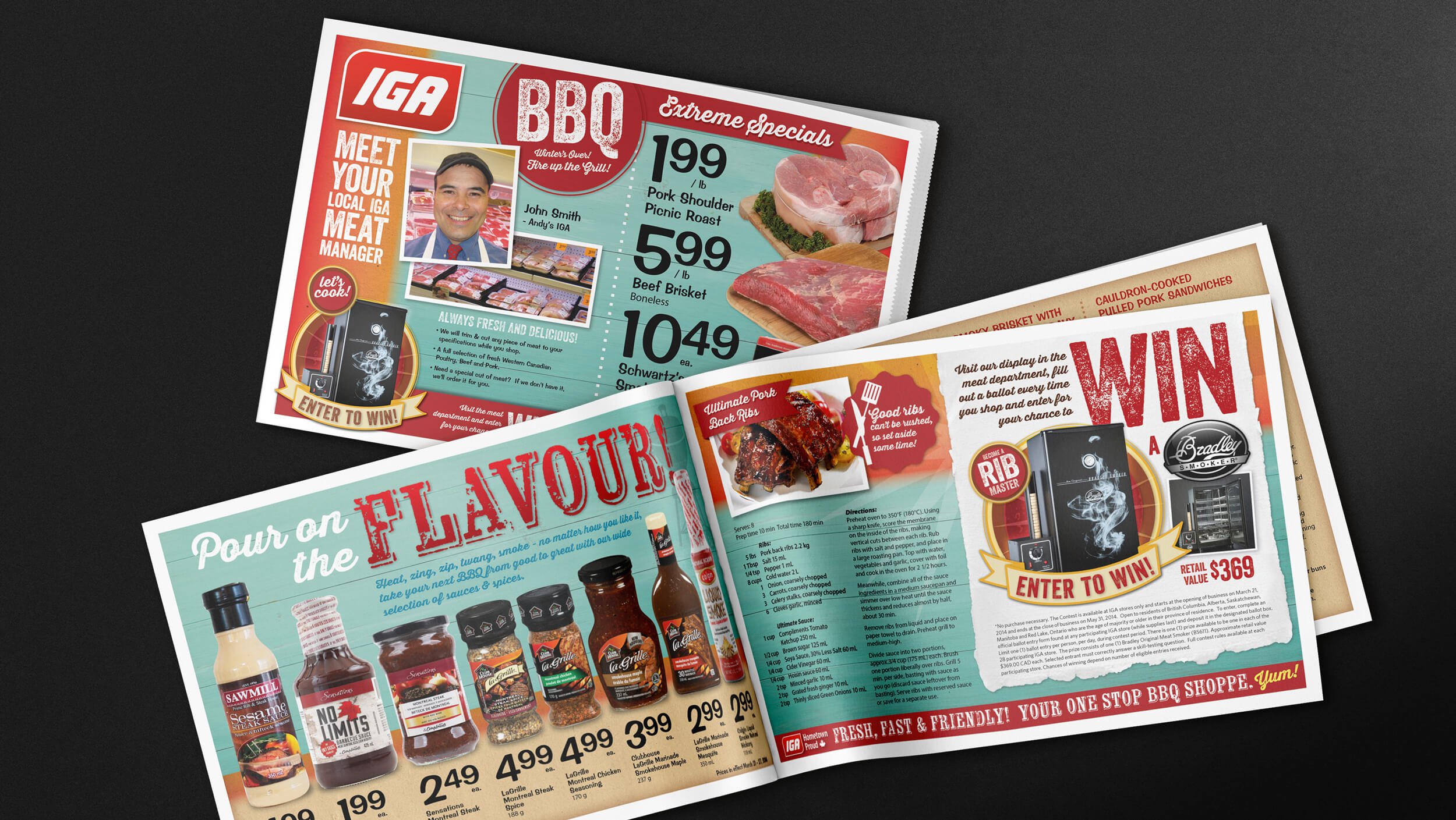
Project Scope — Research, Brand Strategy, Brand Identity Redesign, Environmental/Signage, Web Design, Flyer and Marketing/Point of Sale Collateral.
-
Everything Old is New Again. Through research and consultation it was determined that the IGA brand had strong recognition and customer loyalty, but needed refreshing and updating. As is common with older brands, things had gotten tired, disjointed and lacking a clear direction. We started by refining and cleaning up the logo, similar to the old one, but with subtle refinements that fixed proportions, added a slight red to darker red grad for depth, and a complete logo guideline package with all the file formats necessary for consistent reproduction in print and digital applications. The entire brand identity was reworked with a clean red & white theme for the Canadian market, new font package, contemporary food imagery and a ‘fresh food & local service’ focused approach to messaging and content. From store signage and new flyer formats to promotional items and website, the stores went from disconnected and dated to clean and contemporary. Still the same neighbourhood IGA loved by the community, only better.